Do you think your website needs a refresh? Most of the time when the answer to this question is yes, it’s because of obvious reasons.
It looks old. It has a vibe from the 2000’s or even 2010’s. It makes your brand look uninspiring. You don’t like to send the link to prospective clients anymore. It’s difficult to update. The list could go on…
Technology and especially web design is moving so fast that the longevity of a website rarely reaches 10 years. That is probably the easiest question to ask: when was the website made? If it’s more than 10 years ago, then go ahead and give it a fresh coat of paint. (We mean a pixelated/web coat of paint, of course.)
A website refresh done well requires a certain amount of investment: time, resources, people, finances. You need to have a series of good, solid reasons, to embark on a project of this importance.
So how do you make an informed decision?
We can help you make that decision with a few key questions that you need to ask yourself and your team.
You will notice that our questions go beyond the mere looks of a website.
Why? Because research keeps showing that, while the visual, aesthetic side of the website is important, there are other major areas that you need to consider, like loading speed and responsiveness among others.
With websites – much like a car – the looks matter but it’s what’s under the hood that matters even more.
The best way we can help is by having our designers and developers take a look at your website and assess whether or not it needs a refresh. The second best way is by pointing out 5 key questions that you need to answer when considering a website refresh:
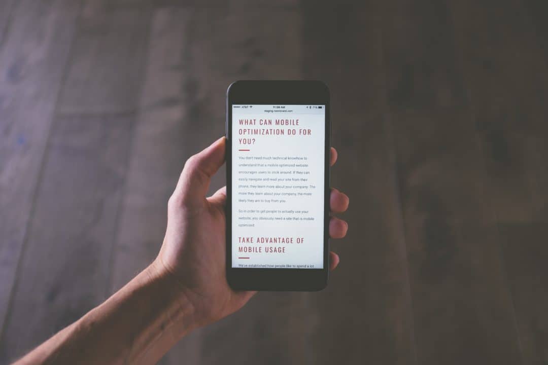
1. Is your website mobile-friendly?
Is your website responsive? Did you get that question before? Didn’t quite know how to answer? What it means is: does your website look good on a desktop as well as on a mobile phone or a tablet? Does the text and especially the images fit the screen well, in any screen size? Is the menu easy to use and are things easy enough to find without too much scrolling?
The trends keep showing that more and more users will access your website from their phone or tablet. Given the variety of screen sizes in both of these types of devices, making a mobile version of your current website is simply not practical. You have to be prepared.
A new, responsive version of your entire website is the solution that will bring more value for the investment, both in time and finances.
Don’t know if your website is or isn’t mobile friendly? Google will tell you in big bold letters if your website is not mobile-friendly, and will point you to a few issues to fix. Use their simple tool: Mobile-friendly Test.
At Enspire, we not only do this simple test before we start on a new website refresh project, but we also keep mobile-friendly-ness in mind from the beginning. We keep responsiveness top of mind the whole project to provide a great experience for users, both on desktop and mobile devices.
2. How many seconds does it take your website to load?
According to the latest research, users are 3x more concerned with the loading speed of a mobile website than how it looks. You’ll read further down just how important looks are, so the fact that users care even more about loading time is a big deal.

Patience is rare, and patience online – even more so.
If your text and photos are not up as soon as the user has clicked on your link, you stand to lose a potential customer.
What is the recommended loading time? At Enspire we always make sure that the websites we make take less than 3 seconds to load, and our goal is to have the websites load in less than 1 second.
A useful tool we use for our clients when it comes to measuring page load speed is Pingdom and GT Metrix.
They will give you a pretty thorough assessment, including a grade. For a more refined analysis, you can register as a user or try their PRO packages. You might need some help to understand parts of their assessments, and if that’s the case, drop us a message and we’ll be glad to help.
3. Is your website up-to-date with the latest SEO practices?
If you’re not entirely sure how to answer this question, we recommend reading one of our previous articles: 5 Key Things to Know About Search Engine Optimization (SEO).
We explain what Search Engine Optimization (SEO) is about and how it helps your website and your business.
When you answer this question – after reading the article – you will look mostly at on-site SEO. Is the content of your website clear and focused? Are your keywords part of your content, and are they still relevant for your business?
SEO questions all boil down to this: is it easy for users to find your website by searching for it on Google, Bing or any other search engine they use that are relevant to your demographics.
There are multiple tools that help you analyze your website’s SEO. Here’s one of them, from Neil Patel: SEO Analyzer.
Based on how you fare, you will need to decide whether the changes you need to make can be applied to your current website for a quick fix, or if a major refresh would make more sense and bring more value.
At Enspire, we can help with both. We always build websites with SEO in mind, and we do that with refreshes too. But we also offer SEO services, giving your website and your business the boost it needs.
4. Does your website have too many sections, pages, subpages?
There are websites that are knowledge-based and they require a complex database.
Most websites, however, do not need more than 5-7 pages and 10-15 subpages. From our experience, even having this many pages is a bit of a stretch.
In web design, this is what we call Site Architecture. What it means is the way that your menu is built, how many pages you have, how many subpages each page has and how easy it is to find your way around the site. This also might mean that all roads will lead to a contact form, or a sale, or a subscription.
All the roads of your website need to lead to the paramount Call to Action.
More than that, ask yourself this: is it easy to find information on your website? How easy is it to read the information? Is the font legible? Is there enough white space so that the information does not feel too crowded and does not tire the eyes? Do the users need to keep scrolling to get to where they need or to have to enlarge the picture/font size to see something (a big no-no!) Are there subpages that take several clicks to get to, only to display only a couple of paragraphs of text/information?
5. Does your website look polished and relevant?
While this is not the most important part, it does matter. Research shows that users form design opinions about a website in less than 50ms. This makes the job of web designers a tough one. They have less than 1 second to make a good first impression. Less than 1 second!
So ask yourself: is your website a visually appealing one? Ask members of your team, ask family and strangers that can give you an honest assessment. Here is a shortlist of elements to pay extra attention to and ask about:
- Does the look still reflect our identity?
- Does the logo look good?
- Do the fonts used look professional/modern/inviting?
- Do the fonts match? Are there too many?
- Do the colors used look fresh and inspiring?
- Is it easy to read the information on the website?
- How appealing do the header (top part) and the footer (bottom part) of the website look?
- Are the pictures used good quality?
Keep asking questions, beginning with, “How does this look?”, “How does it feel”, “What kind of vibe do you get from it?” And if the word “vibe” is a little too hipster for your liking, simply ask people this: “Do you like this website enough to keep looking at it for more than 1 second?”
If you need a more complex, data-driven assessment, you can check out an article from the guys at Elegant Themes called How to Conduct a Design Audit of Your Website.
Now what?
Now that you have answered these 5 questions you can make a more informed decision which will most likely point you to the right solution.
In most cases, it will be one of the following two directions:
You may need minor tweaks here and there.
This might be in the design department, optimization or SEO. If you decide to do this yourself or delegate it to a team member, you need to make sure that your branding and message stays consistent and the new elements don’t clash with the old. If you can’t do that, we’d recommend you get a designer or an agency on board to make these changes for you.
You may need a full-blown website refresh.
Get a professional team to help you with this one. This is definitely where we can come in and help. Our team has successfully completed refresh projects and knows exactly the areas to target for optimal results. We’d be happy to take a look at your website, listen to what your needs are and help identify the best solutions for you and your business.
Feel free to ask us any further questions by setting up a call with us to discuss more.
Related Blog Posts

Podcast: Behind the Story of Enspire
Adam, our CEO/Founder shared about his time with the Peace Corps in Moldova with the My Peace Corps Story podcast. Li...

Logo Design: 5 Things to Keep in Mind
Are you ready to take your company to the next level? Then you are ready to start strengthening your brand. A logo is...
Are you ready to take your company to the next level? Then you are ready to start strengthening your brand. What do you start with? A logo!
Logos are literally everywhere. They seem to follow us wherever we go.
In an era with plenty of products to choose from and little time to analyze every brand on the market, the decision of buying a certain product or not is influenced by its logo. It is as obvious as can be that logos play a crucial role in the success of a brand.
Whether you are looking at a brand new logo or a redesign, the possibilities are endless and let’s face it – overwhelming. This is why it’s important to consider important logo design principles. No need to know and apply every single one, but at least a few.
Even when you are not designing, keeping these principles in mind will help you stay focused and make better choices when collaborating with a designer. To make it easier for you, we’ve put together a list of 5 things to pay attention to when designing a logo for your business.
1. Your logo should reflect your brand
That’s right. A logo is the face of a product. A good logo makes the audience instantly think of the brand it represents.
To get brutally honest for a moment. Logo design is not an art. We are not saying it should not look pleasing to the eye, on the contrary, but it is definitely not the sole purpose of a logo. A logo is a strategic business tool, that will distinguish your brand from a sea of other similar products.
As one of our favorite designers Michael Bierut said:
“Some think of logo design as a diving competition, when really it is a swimming competition. It is not about how big of a splash you make, but how long you keep your head above the water.”
2. Your logo should have a timeless design
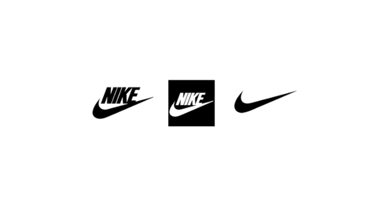
Nike, a good example for a timeless logo. Created by Carolyn Davidson. Below are the 1978, 1985 and 1995 versions.
Trends come and go, but a good logo will withstand the test of time.
When designing a timeless logo, keep in mind that, in most cases, less is more. Opt for simple and recognizable shapes, don’t use unnecessarily complicated graphical elements, don’t use a visual just because it is trendy or it looks good. The more complex the design, the faster it will date. If your logo includes text, make sure to use classic, well-crafted fonts. Do not exaggerate with decorative fonts. In fact, if you can, use only one font, otherwise, your design will look busy to the eye and hard to remember. However, if you want some variety, use light/bold combinations of the same font, or check our work.
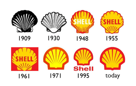
Shell, another logo that defied time, designed by Raymond Loewy.
3. Your logo should be simple
We simply cannot stress that enough. Less is more.
Minimalism has, is, and will always be a good idea. It is more than a trend. Paradoxically, a simple logo will convey more meaning than a complex one. The explanation is… simple (pun intended): simple logos can be interpreted in more ways than complicated ones, so they mean something else to everyone. In this way, everyone gets them, and everyone can relate to them. This is why popular brands have simple logos.
Good brands don’t need to prove that they are good, hence their simple logos.
Another perk of keeping it minimal is that such a logo is easy to manage and scale: it looks good on both a business card and a 6ft banner. Last but not least, an overcomplicated logo looks desperate, it looks like the brand tried too hard, and that doesn’t inspire trust.
4. Your logo should have wisely chosen colors
The color palette is one of the most important parts of a logo. Color choosing should not be a superficial decision. The right colors help you communicate the right ideas to the audience. It sets the tone for how you will be perceived as a brand.
For example, dark blue is associated with trust and reliability, as well as peace. Light blue is more refreshing, it represents ideas and innovation. This is why banks and politicians often use dark blue, while startups tend to use light blue. Red is a very emotionally intense color. It symbolizes energy, this is why a lot of energy drink brands use this color. Red, being a highly visible color, is also used to indicate danger, for this reason, it is used in traffic signs. Purple represents prestige, and green is associated with nature and life.
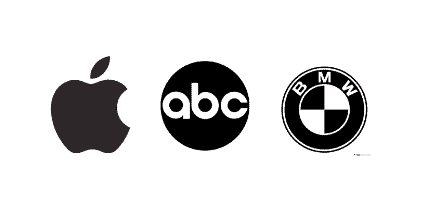
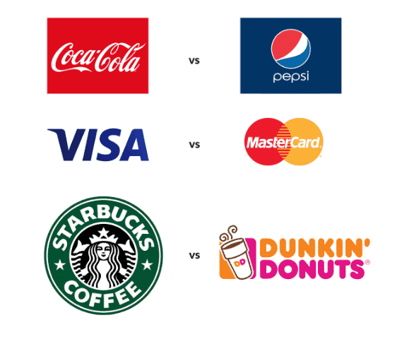
One interesting thing to note is that the biggest brand rivals use opposite colors in their logos:
Personally, some of our designers enjoy using black and white their designs.
An achromatic color palette provides versatility and timelessness to a logo. It can make a logo look both edgy and elegant. Black is a very bold color, it shows authority and power, while at the same time being less aggressive and emotionally stimulant as other powerful colors.
Some of our designers often use black & white with bright color accents – it draws attention to the vital parts and it makes the overall design pop.
5. Your logo should avoid clichés
New trends appear every now and then. I’m not saying it is bad to keep up with the new fads, but when the same idea is used over and over again, it comes to a point when it’s irrelevant.
Using a generic design defies the sole purpose of the logo – to be recognizable. Like using a globe to represent an international company, or a light-bulb/rocket for a startup. These are not bad ideas, but you should use them only if they represent your brand. Even if you use a popular symbol, bring your own twist to it, make it original, own it.
Before wrapping up, something we say at Enspire is: “logo design is more than just eye candy.”
You can take a look at some logos and other things we’ve created for our clients by checking out our work.
In a nutshell
A logo is a powerful tool to express your values as a brand, to communicate with your potential clients, earn their trust and build a strong connection. Define your brand story, be mindful of solid design principles and create a logo that will take your brand to the next level.
You don’t have to do it alone, either, as our design team would be glad to help. So get in touch!
Related Blog Posts
Podcast: Behind the Story of Enspire
Adam, our CEO/Founder shared about his time with the Peace Corps in Moldova with the My Peace Corps Story podcast. Li...

5 Best Website Hosting Providers for WordPress
In the following guide, we take a look at the 5 best website hosting providers for WordPress. We often get questions ...