Uniqa: Defining a Clear Brand and Website for a New Market
Visit WebsiteOverview
In a rapidly changing and expanding global industry, Uniqa’s previous brand and website was positioned for a localized Eastern European market. Their team collaborated with Enspire through an intensive “Discovery” process to redefine their product offering and communication strategy. As a result, Uniqa is prepared to use its new brand and website to target western market opportunities.
The Challenge
Uniqa is shaking-up the traditional real estate development market with energy-efficient and time-saving construction and building solutions. When they came to us, their online presence was solely targeting and speaking to the needs of the local market. As pioneers in their field, they needed a clear brand message, logo, website, and marketing strategy to support their expansion into Western Europe.
The Solution
Before beginning the logo or website design process, we implemented a “Discovery” phase to clarify Uniqa’s brand positioning, product offering, and online presence strategy. We visited their company factory and construction site to take photos and incorporate elements of the company’s products in the logo design.
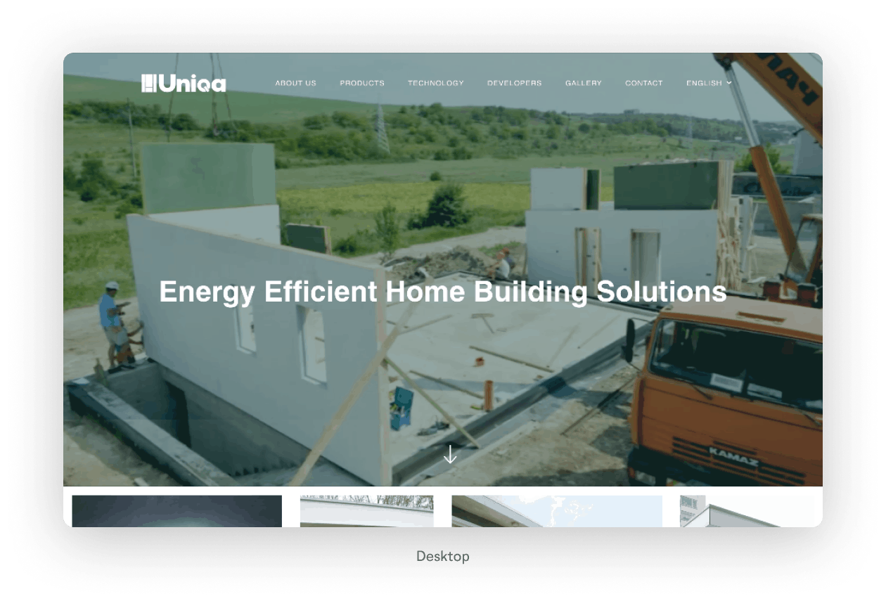
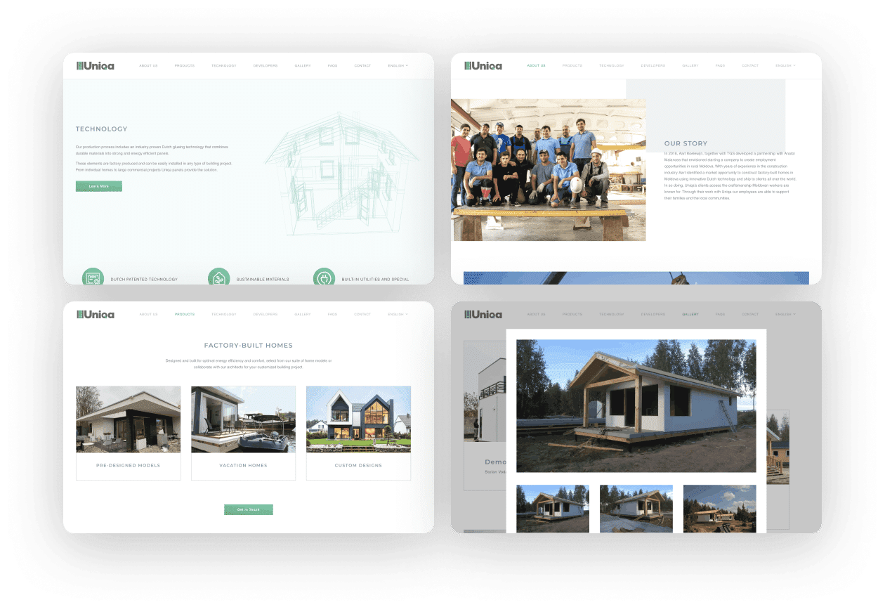
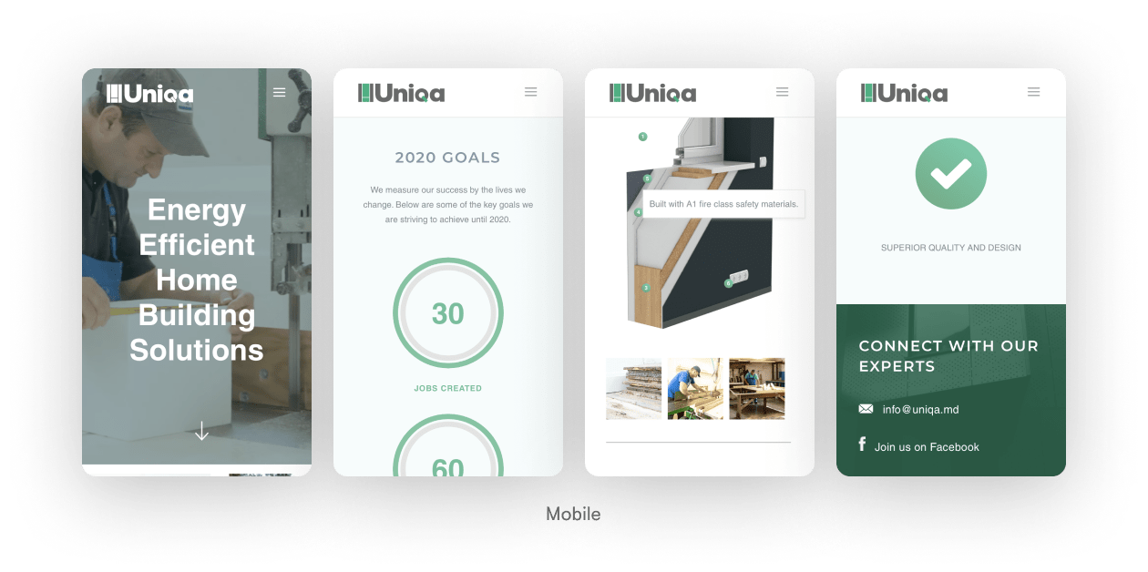
Significant emphasis was placed on designing a website user experience that would allow three distinct categories of website viewers (customers, partners, and investors) the ability to quickly find the information they need. Uniqa’s ultimate goal was to drive website viewers to schedule a call with their sales representatives, therefore we strategically placed a one-click call to action throughout their new website.
Logo Inspiration
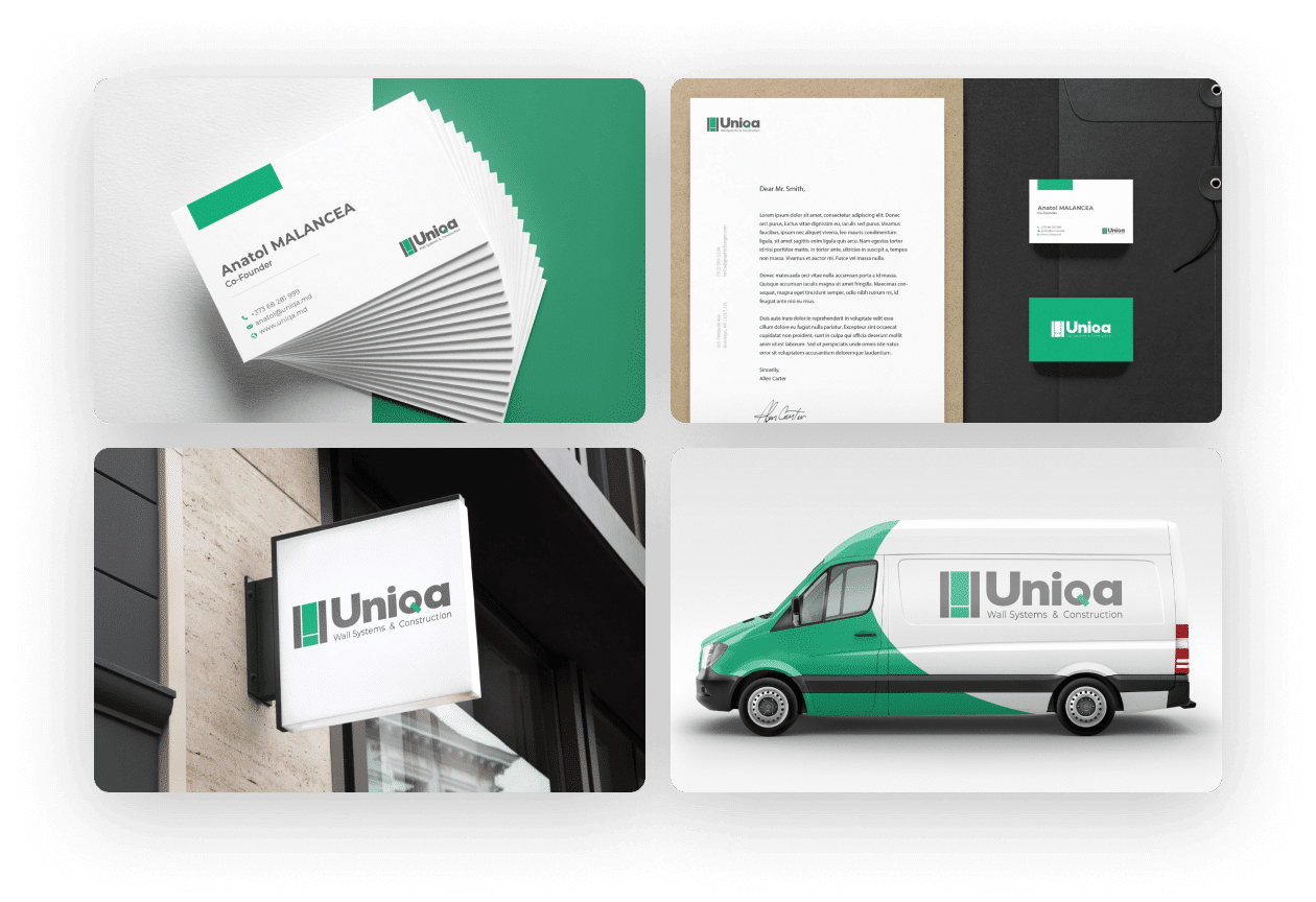
The logo is inspired by the layered panels Uniqa uses to build homes. The rectangular shape represents stability, security, and strength–portraying Uniqa as a trustworthy company. Basic geometric shapes used in the logo mark represent the advantage of “simplicity,” which Uniqa’s technology offers.
The color palette is green and gray. Green represents youth, life, and a healthy environment and lifestyle. It also has connotations of abundance, peace, and development. The dark gray brings in a sense of elegance, respect, wisdom, and balance. It is softer and more approachable than black, but just as timeless in terms of style and design.

Branded Assets
As pioneers in their field, they needed a clear brand message, logo, website, and marketing strategy to support their expansion into Western Europe.
